- Round numbers pulled the field across the line — visible clusters formed just under 3:00, 4:00, and 5:00, with the minutes just above each conspicuously thin. More than half the field (54%) finished under four hours, many of them by seconds.
- Faster runners ran hotter, not cooler — sub-3 finishers avg 167 bpm across the whole race; six-hour finishers averaged 154. The front of the field sits closer to threshold for longer, while walk breaks at aid stations drag the back's avg down.
- Health sensors disagree about calories — Garmin reports a flat ~70 kcal/km from sub-3 to 6+ hour finishers, exactly what physiology predicts. Coros bends 47% upward as runners slow down.
Marathon Series
The Data Behind the London Marathon
By Alistair Brownlee, Cameron Crawford and Halvard Ramstad
April 27, 2026
Get the latest Terra Research reports

By continuing, I agree to the Privacy Policy and Terms of Service.
I've always been fascinated by humans breaking "barriers." Bannister's 4-minute mile in 1954 has the cultural weight of a creation myth. The man, the cinder track at Iffley Road, the pacers, the medical-student-turned-myth. And yet I'd argue that what happened on the streets of London yesterday morning could be bigger.
The two-hour marathon had been talked about for decades. My friend Michael Joyner predicted it back in 1991. In a single-page paper in the Journal of Applied Physiology, he modeled the marathon ceiling from first principles (VO₂max, lactate threshold, running economy) and landed on a hypothetical best of 1:57:58 (Joyner, 1991). The world record at the time was 2:06:50. Mike was suggesting nine minutes of physiological headroom that nobody had yet found. The paper was treated, charitably, as provocative. Eliud Kipchoge ran 1:59:40 in Vienna in 2019, but it didn't count; staged conditions, rotating pacers, no race. Kelvin Kiptum's official world record sat at 2:00:35 and looked like the asymptote of human possibility. People wrote essays about whether it was even physiologically attainable in a real race.
Then Sabastian Sawe ran 1:59:30, taking 65 seconds off Kiptum's record, in a race, on London streets. Yomif Kejelcha came home second in 1:59:41, the second man under two hours, on his marathon debut. And Jacob Kiplimo finished third in 2:00:28, also inside the previous world record. Three men, one race, all faster than anyone had ever run before. It's fair to say a barrier has been well and truly broken. We've seen this pattern before: Bannister's mile had stood as a ceiling for nine years, and just 46 days after he ran 3:59.4, John Landy went 3:58.0 in Turku
Three years later, Derek Ibbotson took it to 3:57.2; by 1958, Herb Elliott was at 3:54.5. It seems the barrier wasn't really physical; it was psychological, and once the first man stepped through, the rest of the field followed in a cascade. Yesterday it took 11 seconds, not 46 days.
Unfortunately, we don't have Sawe, Kejelcha or Kiplimo's wearable data on Terra. But we do have data from over 500 runners who lined up in Blackheath yesterday morning. So while the elites were rewriting the record book at the front of the field, what was happening in the rest of the race? What can the data of the other 99% tell us about a marathon, a course, and the watches we strap to our wrists?
Quite a lot, as it turns out.
The data, and why cleaning it mattered more than analyzing it
The raw export contained 921 activity records uploaded on race day. After filtering to actual marathons (run type, 41.5–44.5 km, 2–7 hour duration, started in Blackheath/Greenwich) and removing duplicate uploads, I landed at 571 unique runners.
A caveat before we go further: this isn't a representative sample of the 56,000 people who ran London. It's the subset who own GPS watches and have linked them to a Terra-using app. They skew faster and more tech-savvy. So treat the numbers below as a window into one slice of the field, not the whole race.
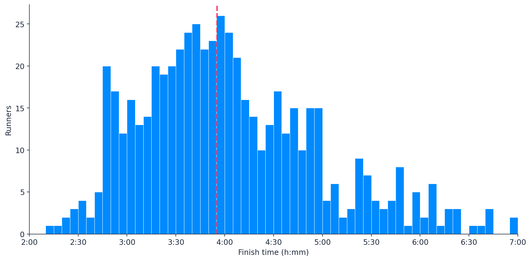
Where the field actually finishes
If you spent yesterday morning shouting from the kerb on the Embankment, this is the distribution of finishing times you were watching go past:
The peak sits between 3:30 and 4:00. Median finish time was 3:55:13. Just over half the cohort (54%) went sub-4, 12% went sub-3, and 86% finished under 5 hours. The fastest in our sample crossed in the incredible time of 2.11, and the slowest in nearly 7 hours.
You can see the famous "round-number magnetism" right there in the histogram. Notice the secondary cluster between 4:30 and 5:00 — that's the sub-5 target group, the same psychology that gives sub-3 and sub-4 their disproportionate density. People train for, and race for, the round number. I’ve certainly been there, and the data shows it.
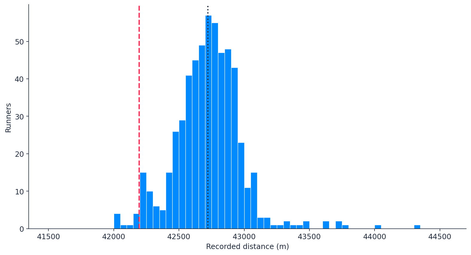
The 42.2 km that wasn't 42.2 km?
Here's something most marathon runners only suspect until they look at the numbers:
The course is 42,195 meters — that red dashed line on the left. Almost no one's watch agrees. The median runner's watch recorded 42,722 m, 527 meters further than the actual course, a 1.25% overshoot. The whole distribution sits to the right of the true distance, with a tight peak around 42,700 m and a long, thin tail that drifts as far as 44 km.
Where do those extra 500 meters come from? Three mechanisms, all probably contributing:
- The pre-start corral. Back-of-the-pack runners can wait minutes in their starting pen before they actually cross the start line. A lot of people press start on the watch when they leave the corral, not when they cross the timing mat. Every step of that walking shuffle gets logged as marathon distance.
- Weaving in the pack. Slower runners spend more time in dense traffic, around aid stations, and away from the racing line. Real extra meters trodden.
- GPS jitter. Every GPS watch has small position errors that accumulate over time and they accumulate roughly linearly with how long you're moving.
The data backs the corral theory: there's a strong positive correlation (Spearman ρ = 0.60) between finish time and recorded distance. The slowest quartile of runners recorded a median 42,856 m. The fastest quartile recorded 42,547 m. A 309-meters gap between the front and the back, on the exact same course.
There's a subtler observation hiding in that left tail of the distance chart, too, about thirty runners whose watches recorded less than 42,195 m. That could be due to the tunnel sections of the course or city-canyon GPS dropouts, where the satellite signal can't keep up, or maybe they found a shortcut!
Faster runners run with higher heart rates
Across the cohort, finish time and average heart rate are negatively correlated:
| Finish band | Median average HR |
|---|---|
| Sub-3:00 | 167 bpm |
| 3:00–3:30 | 167 |
| 3:30–4:00 | 165 |
| 4:00–4:30 | 164 |
| 4:30–5:00 | 161 |
| 5:00–5:30 | 155 |
| 5:30+ | 154 bpm |
Sub-3 runners average around 167 bpm for the entire race. Six-hour finishers average around 154. That's a 13-bpm gap, and the direction is the opposite to what you may assume. You might think the faster runners are the fittest and operating well within themselves while the strugglers redline.
Two things drive it. First, faster runners genuinely are working harder in absolute terms. Their fitness allows then to push closer to their maximum for the duration of the race. They're closer to lactate threshold for 26 miles, which sits at higher absolute HR than easy aerobic effort. It’s thought that the very top runners can operate within a few % of this threshold for the whole 26.2 miles. Second, slower runners take walk breaks at aid stations, often more than they realize, and every minute spent walking drags the average down.
I'd love to look at this in %HRmax terms rather than absolute bpm, which would normalize across age and sex differences and probably tell a cleaner story but the user max-HR field was empty in this export. This is probably one for our next dataset.
Pacing discipline shows up clearly in the data
We don't have splits in this export, so we can't compute classic positive/negative split analysis. But there's a back-door proxy: the ratio of max_speed to avg_speed over the race. A well-paced runner has a low ratio — their fastest moment isn't far above their average. A blow-up has a high ratio.
| Finish band | Median max/avg speed ratio |
|---|---|
| Sub-3 | 1.26 |
| 3–4 hours | 1.39 |
| 4–5 hours | 1.41 |
| 5h+ | 1.57 |
Sub-3 runners ran within 26% of their average peak. The slowest band hit pace bursts 57% above their average — start-stop-start-stop pacing instead of holding a steady effort. It's exactly what you'd expect: discipline is the thing that separates a 3-hour runner from a 5-hour runner more than fitness alone.
A device-level oddity (with a big caveat)
The cohort split roughly 75% Garmin, 21% Coros, with a handful of Polars and a few unknowns. When you compare the two big device populations, most numbers agree — average HR (164 vs 163, statistically indistinguishable), max HR (182 vs 181, indistinguishable), GPS distance (42,734 m vs 42,703 m, indistinguishable).
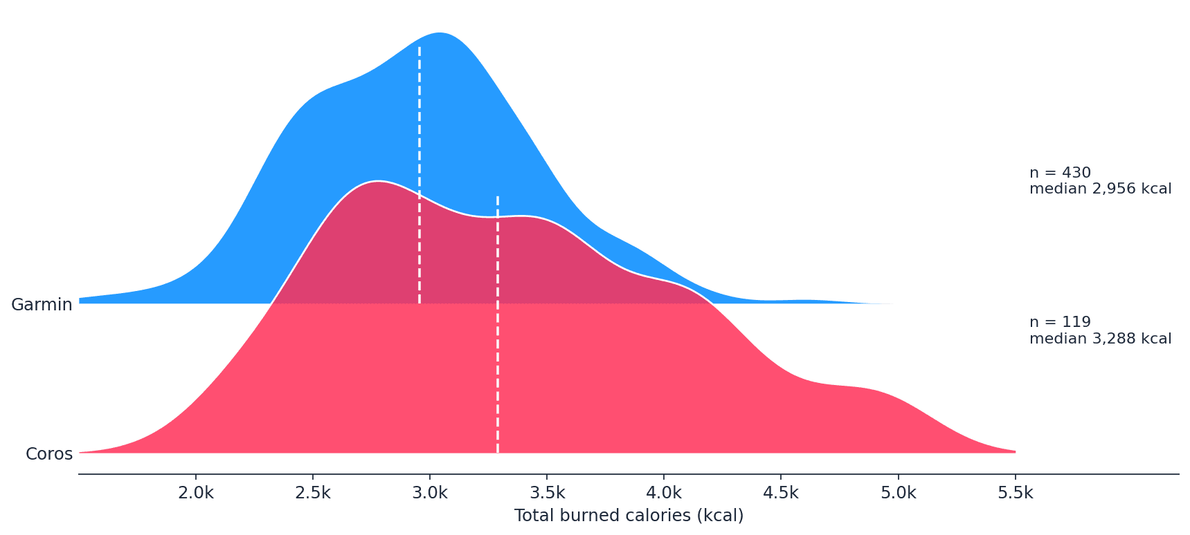
The chart tells the headline: Garmin runners are tightly clustered around 2,956 kcal, while the Coros distribution is shifted right (median 3,288 kcal) and has a long tail stretching past 5,000 kcal. A 12% gap at the median, and a much heavier upper tail. The obvious question is whether the high-burning Coros runners are working harder, or simply different.
They're not working harder, but actually slower.
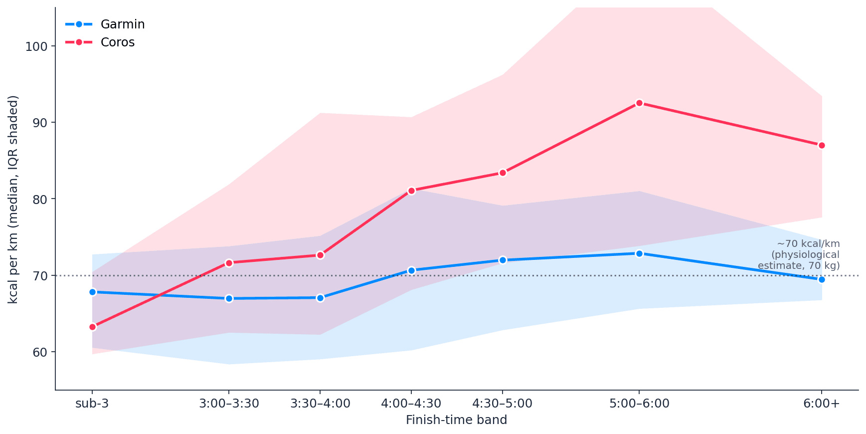
This is the chart that I think is genuinely interesting. On the y-axis, kcal per kilometer. On the x-axis, the finish-time band. The dotted line at 70 kcal/km is the textbook physiological estimate for a 70 kg runner: roughly 1 kcal per kg per km, largely independent of speed. That's what the literature says marathon energetics should look like.
Garmin's line sits almost exactly on it. From sub-3 to 6+ hours, Garmin reports 67 to 73 kcal/km, a small drift that's consistent with the modest economy penalty slow runners pay. The blue line is what physiology predicts.
Coros's line is doing something different. It estimates a 47% increase in reported energy cost per kilometer, which physiology doesn't really support. Running a kilometer slowly costs you a bit more than running it quickly, but not 47% more.
What seems to be happening is that the Coros algorithm is heavily weighting time on feet. Slow runners are out there for five or six hours instead of three, with elevated heart rates and frequent walking sections, and the Coros model keeps accumulating calories through that extra time at a rate that's hard to justify mechanically.
A caveat I have to flag: we still don't have user weight, sex or age in this export. So in principle the Coros cohort could be heavier on average than the Garmin cohort, which would mechanically produce more calories. But a uniform demographic offset would shift the Coros line up by a constant amount, not bend it upward with finish time. It looks more like an algorithmic choice than a population difference.
This is, I think, a genuinely useful test signal for wearable calorie models: kcal/km should be roughly flat across finish-time bands on the same course on the same day. It's a self-contained plausibility check that doesn't need any reference lab data. The practical takeaway: calories from a watch are a model output, not a measurement, and the slower you run, the further from physiology that model can drift.
What the marathon revealed
Sawe's 1:59:30 will be the headline number for years. But it's worth zooming out for a moment. Bannister's 4-minute mile mattered not because it changed what was physiologically possible; within a few months of Bannister's run, John Landy ran 3:58, and within a decade, dozens of athletes had broken four. The barrier was psychological. Bannister proved it could be done; everyone else then realized they could too.
The two-hour marathon barrier had the same shape. We knew, abstractly, it might be possible. Kipchoge's 2019 Vienna run hinted at it. Kiptum's 2:00:35 sat close.
What I find most fascinating isn't that the record fell. It's that it fell convincingly. The asymptote turned out to be a step we could walk through. This is another principle I find interesting in endurance sport; progress is not linear, but happens in steps.
The 571 runners in this dataset were sharing the streets of London with that moment. Their watches were recording the same air, the same pavement, the same cool (the conditions definitely helped compared to hitter other years) spring morning.
Most of them recorded 1.25% further than the course says they did, with their hearts beating around 165 bpm, and each of them has their own story about where the corral started, where the race finished, and where the wall came up.
A good day for the marathon. A great day for the sport. And a quietly fascinating dataset to sit with the morning after.
References:
- Joyner MJ. Modeling: optimal marathon performance on the basis of physiological factors. J Appl Physiol (1985). 1991;70(2):683–687. https://journals.physiology.org/doi/abs/10.1152/jappl.1991.70.2.683
- London Marathon Events. London Marathon Results. https://www.londonmarathonevents.co.uk/london-marathon/results
- Olympics.com. London Marathon 2026: All results, times and standings — full list. April 26, 2026. https://www.olympics.com/en/news/london-marathon-2026-all-results-times-and-standings-full-list
- The Guardian. London Marathon hails greatest day as Sawe breaks two hours and records tumble. April 26, 2026. https://www.theguardian.com/sport/2026/apr/26/london-marathon-hails-greatest-day-as-sawe-breaks-two-hours-and-records-tumble


